I recently visited the new Chicago Poetry Foundation building, located at 61 West Superior. It’s designed by local architect John Ronan. As a building dedicated to the study and creation of poetry, it presents the act of inhabiting and moving through space in a poetic light. As a complement to one of our architectural tours, it is definitely a must see.
Local Contemporary Architecture
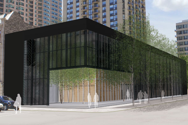
When I happened upon the structure for the first time, on the street it appeared as a simple box. Devoid of windows, it’s only broken up by an open corner presented to the intersection of Superior and Dearborn. As I moved around the building, the stark solidity of the box began to dissolve into a kind of veil. The design subtly drew my curiosity to a court with ghostly trees inside. Dennis Rodkin of Chicago Magazine notes the building’s “layered materiality invites exploration.” Clad in perforated, pre-oxidized zinc, the quiet exterior shell of the Poetry Foundation presents a minimal façade to the street, all the while allowing a public courtyard beyond to mediate between the internal spaces of the foundation and street, without becoming an obvious extension of the sidewalk.
Exploring the Poetry Foundation Building
Moving toward the open corner, the attention to detail became apparent. “Poetry Foundation” was spelled out in a brushed metal, cast into the first step up into the building. It was the only signage indicating the purpose of this place. Like most of the spaces and details of this building it was not meant to create a spectacle. Instead, it awaits discovery by the curious, intellectual urban explorer. Stepping up into the open corner invites one to enter this quiet, contemplative world Ronan has created.
Upon initial entry I became briefly confused as an eddy of space was revealed. I found an court that was easily interpreted as the main entry, though it is a dead end. I believe this was a poetic gesture by the architect to remind us that things may not always be as they seem, rather than just an oversight. To the right is a long passage, confirming the presence of those trees and a larger court beyond, and tempting one to explore. One proceeds between the glass façade of the foundation building itself, and that beautiful zinc screen.
Other Thoughts
Chicago Tribune architecture critic Blair Kamin aptly describes the building as “mysterious, engaging, richly layered and revealing.” Moving within and through allows vignettes of space beyond to open up and be discovered, one by one. From a simple box dissolved into a veil that hints at what is beyond, to a small opening, to a passage and into a larger courtyard. Within that courtyard, large walls of glass beyond further dissolve away into the reading rooms and lecture hall inside. This process of peeling away layers of space to reveal vignettes that compel one further into yet another space has hints of what Luis Barragan called “architectural strip tease.” It is as if, by giving us a mere glimpse of what lies beyond, the architect is drawing us farther and farther in. Like a good poem.
For some more fantastic images, including of the design process, check out Mark Boyer’s article on Curbed.com.
