Architect Louis Sullivan was a philosophical force behind the Chicago School of architecture. His famous works, like the Auditorium Building and Sullivan Center, both of which we visit on the 1893 World’s Fair Tour, were hugely influential. The phrase “form should follow function” seems to be eternally paired with the man’s name in history textbooks. Here is a recap of “Louis Sullivan’s Idea,” a 2010-2011 exhibit at the Chicago Cultural Center.
Sullivan-esqe Detail and Design
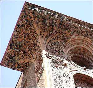
Tracing the curves of a decorative frieze from a Sullivan building could be as fun as sticking a fork in a fondant flower on a slice of wedding cake. The variety of surface, shape and size of Sullivan’s details makes it incredibly appealing to the eye.

Architectural historian Tim Samuelson teamed up with the iconoclastic comic book artist Chris Ware to design an exhibit that keeps the eye dancing from wall-size, blown-up photos of buildings to detailed balustrades, stencils and chunks of terra cotta friezes. Glancing up to the top of a Sullivan building, you get the sense of sweeping verticality that the architect emphasized. Focusing in on a plaster ceiling panel from the Auditorium Theater hotel, you see how Sullivan brought out the plastic qualities of his buildings to make them pulse with life. And touching the iron newel posts of staircases that once graced homes designed by Sullivan with his partner Adler, or the enameled hunks of brick set out on tables, you experience the sensual aspect of architecture.
Memories and Mementos of Demolished Masterpieces
As a new tour guide leading tours of Chicago with Chicago Detours, I attended a meeting of the Chicago Tour Guides Professional Association in March. Samuelson spoke, and he regaled the audience with stories of a childhood spent searching the city for Sullivan buildings. He later accompanied the photographer Richard Nickel on expeditions to
salvage remnants from the wrecking ball. Many of those pieces ended up in this exhibit. The city’s official cultural historian said he wants visitors to touch the remnants on display, to feel the energy that surges through a Sullivan building. (Samuelson joked that he was left at a loss for words when one person actually asked if he could lick the display items!) The Cultural Center seems to have nixed the idea of using signs to authorize such tactile temerity, but nothing here is under glass or behind barriers.
Blending Old and New
Sullivan’s association with new and the modern didn’t come from an aversion to ornament, as anyone whose seen the intricate entrance to the former Carson Pirie Scott store (soon to be a Target) can attest. I learned from the exhibit that Sullivan’s love of swirling, organic forms began with observing the natural cycles on his grandparents’ Massachusetts farm. It was further indulged in the rose garden he cultivated in his summer home in Ocean, Mississippi. Of course, Sullivan encouraged that passion for the natural in his protégé, Frank Lloyd Wright.
 The vibrancy of Sullivan’s buildings becomes visceral in this exhibit. That vibrancy allowed Samuelson to instinctively pick the master’s buildings out from a block of lesser edifices on his childhood quests. That’s apt, because one of Sullivan’s big ideas was that each individual is unique in his time and place and is most powerful when he honors his
own unique creativity.
– Jenny Slosar, Tour Guide


